-
Creating an exciting identity for a dynamic, grass-roots charity.
-
How do they make a difference?
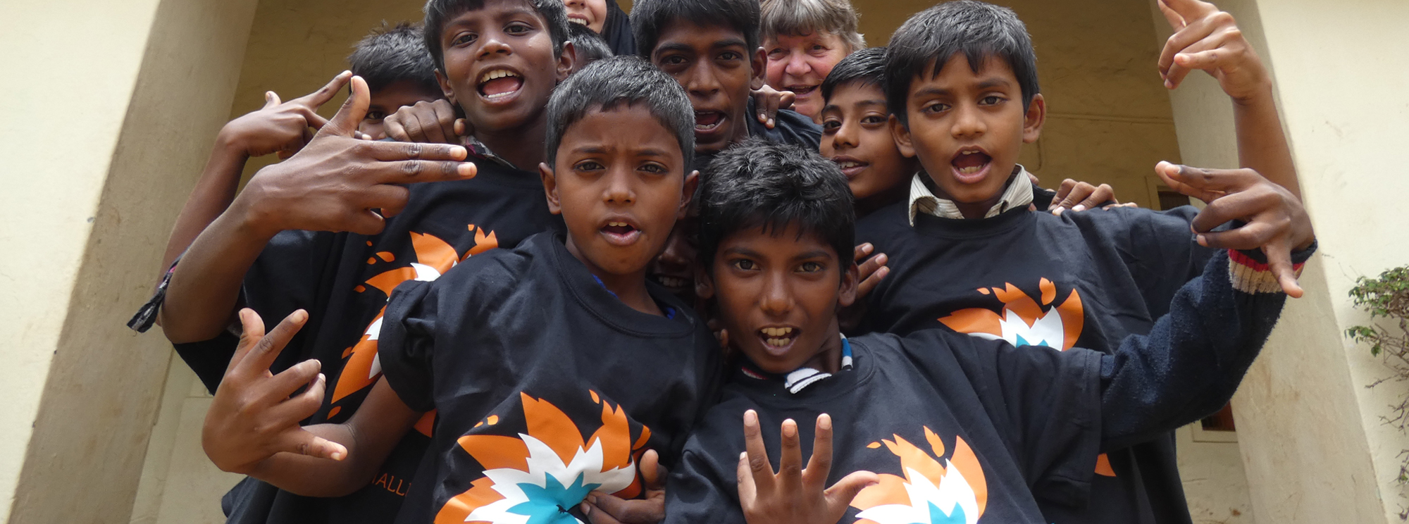
An English charity with a heart for India, Chennai Challenge was formed in 2005 in Guildford by friends from the YMCA. The charity provides regular visits to support local projects in Chennai, whereby young, time-rich Brits could be challenged to step outside their comfort zone and make a genuine difference to the lives of those that really need it.
-
What we did for them
The Chennai Challenge ethos revolves around a vibrant, positive and energetic attitude. Volunteers are encouraged to participate fully and the experience of taking part in the annual trips often results in eye-opening impact on their own lives, just as their presence and enthusiasm brings joy and practical help to the folks they are visiting.
-
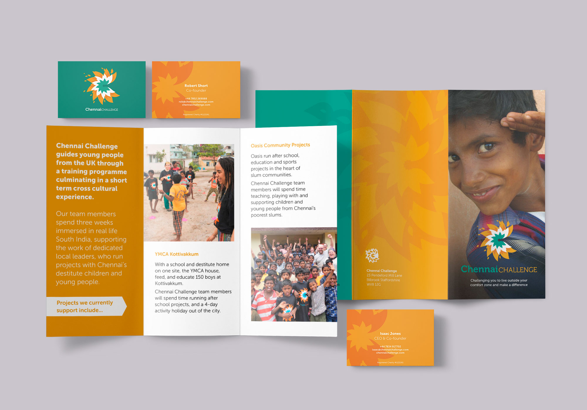
The logo represents this energy with flames that dance around an abstract letter C, vibrantly coloured using adapted colours from the Indian flag, and can be cropped to create dynamic supporting graphics where required.
-
How did this make a difference?
The logo and overall identity has served Chennai Challenge tirelessly for over 15 years.
It brings a sense of professional pride and ambition to what is ultimately a very small organisation of faithful and commited people with a big vision to bring hope. This gives them great confidence when it comes to fundraising, building relationships with partner organisations, recruiting and training new volunteers.
“The logo that Upshot designed took our brief and captured it in a vibrant and energetic way that we would never have imagined. The quality was superb and we are delighted with the results.”
Rob Short, Chairman
Chennai Challenge